As you are probably aware, Broad River Rehab created Staffing Navigator to make it easier for facilities to understand the interaction between staffing levels and star ratings. (If you haven’t heard of Staffing Navigator, check your app store. It’s free and we’ll train you.)
We learned a lot of things creating that app. The original plan was to create a “Quality Measures Navigator” app after Staffing Navigator. We wanted to create something to give people a starting point when it comes to quality measures; a road-map to improving quality measures. There were a lot of disadvantages to doing that. Two of the biggest problems:
-
The data we used for Staffing Navigator comes from the 5 Star Data set. That data is useful for long-term changes like hiring and acuity, but less so for quality measures. Using the 5 star database for quality measures is akin to steering with the rear view mirror. The data is pretty old.
-
When it comes to Quality Measures, we believe that CMS is going to continue to make changes. The quality measures are a moving target. As a result of this, data.medicare.gov is not so great. The data is spread across at least three tables. Making things more difficult, some measures have different supporting data. In short, CMS doesn’t provide enough data on data.medicare.gov to accurately recreate the data.
So, we decided to take things in a different direction. We built a tool that will analyze the latest information from your CMS reports and help you find opportunities to improve your quality measures. It even has a simple drag and drop interface.
We’d Like YOUR Help
This tool is brand new and we’d like your help testing it. All you have to do is drop your report on the webpage (link below) and look at the results. We’ll even help you interpret your data!
How?
It’s pretty simple.

-
Download your “Provider Rating Report”. The date of the report doesn’t matter, but it must be the correct report. The first page should look like the image to the right. If the report doesn’t say “Provider Rating Report”, it isn’t the correct report and will not work.
-
Head over to our CASPER Report Scanner and upload your report. (Yes, we need a better name. You can use the form below to suggest one!) You can either drag and drop the report onto the tool or click the link to browse to your file.
-
After the upload completes, results are displayed automatically.
Interpreting Results
The rest of this posting will show you what the results mean.
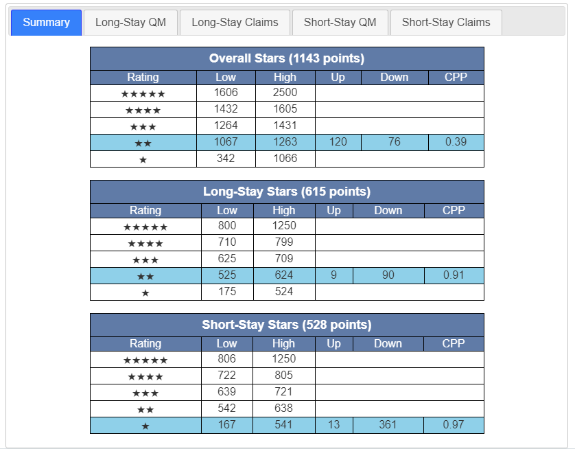
The summary is the place to start. In this case we can see this is a 2 star quality measure facility. We can also see that this facility is 120 points away from three stars and 76 points away from 1 star. The metric CPP is a measurement that tells you where you are positioned between the cutpoints. A CPP of 0.5 means you are exactly between cutpoints. This facility has an overall CPP of 0.39 meaning it is on the low side of 2 stars.
Taking a look at the long-stay, The CPP of 0.91 means we are very close to the next level of 3 stars. This building is only 9 points away. That means there may be opportunities to pick up a quick 15 or 20 points and hit 3 stars for Long-Stay. The short stay section works the same way. (Keep in mind that the short-stay metric is scaled to match the long stay. If you don’t know what that means then don’t worry about it.)
Long-Stay QM
Moving on to Long-Stay QM. (Note that I’ve switched to a different report for illustrative purposes.)
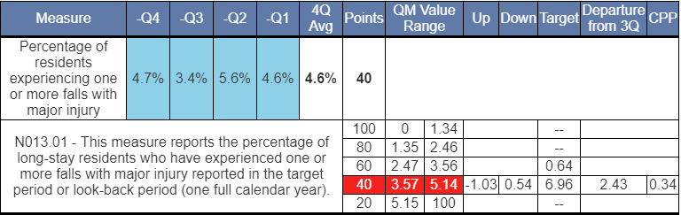
You can see that this facility is color-coded red, meaning this measure is on the low end of the scale with only 40 points. The rest of the measures are designed to help you understand where you’d need to be in the next quarter.
In this example, the 4.7% is the oldest quarter and will be rolling off. Take a look at the Target column. This represents the value you would need in the new quarter to achieve those points. In this particular case, this facility can do as poorly as 6.96% and still get 40 points. To get to 60 points, this facility would have to get down to 0.64%. This is a level that far lower than they’ve demonstrated recently. This means that while falls are obviously a great concern in this facility, it’s unlikely to net any additional points in the coming quarter. That’s not great news, but it’s better know what you’re up against, right?
Other Metrics:
-
CPP tells us we are on the low end of the cutpoints, but not terribly close to moving to 20 points.
-
Departure from 3Q tells us we could be 2.43% worse than our 3 quarter average and still maintain 40 points.
-
The Up and Down targets are simple differences between your 4 quarter average and the cutpoints. (This is similar to CPP, but some people understand one of the other more easily.)
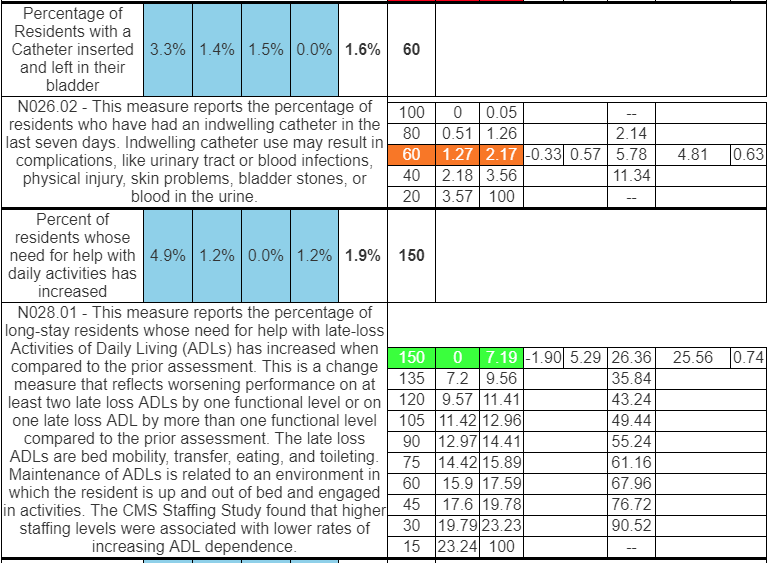
I’m including a couple more metrics between so you can get a sense of how this works. Try uploading your report to get a better idea. Short-Stay QMs work the same way.
Claims-based measures are displayed a slightly different way since CMS provides different information about those. Take a look at that section on your own.
If you have any questions or comments about this tool, I’d love to hear from you. Use the form below.
We are also looking for a name for this tool. Send me your suggestions!
We’d like to hear from you!
Is this tool helpful? Would you like more? Staffing? Health Inspections? Some other report?
Please send us your feedback, good and bad!