
PDPM and Non-Therapy Ancillaries
The non-therapy ancillary (NTA) part of the patient driven payment model (PDPM) is considered by most people I’ve talked to as being better than what we’re currently doing. It more accurately accounts for expenses and isn’t overshadowed by therapy.
In this post I’m going to take a deeper look at it and calculate the average NTA payment by state and facility. I’ll also compare urban versus rural facilities when it comes to NTA case-mix.
(By the way, we created a PDPM Calculator for you to experiment with and get a better understanding of how PDPM works. Try it out!)
Let’s get started!
Your NTA payment is driven by the presence of a number of conditions and/or extensive services. Points are scored if the condition or service is present. See the table below.
| Condition/Extensive Service | MDS Items | Points |
| N/A (SNF claim) | 8 | |
| K0510A2,K0710A2 | 7 | |
| O0100H2 | 5 | |
| O0100F2 | 4 | |
| K0510A2,K0710A2,K0710B2 | 3 | |
| I8000 | 3 | |
| O0100I2 | 2 | |
| I8000 | 2 | |
| I5200 | 2 | |
| I8000 | 2 | |
| I6200 | 2 | |
| I8000 | 2 | |
| I8000 | 2 | |
| I2500 | 2 | |
| I2900 | 2 | |
| I8000 | 1 | |
| I8000 | 1 | |
| I8000 | 1 | |
| M1040B | 1 | |
| I8000 | 1 | |
| I8000 | 1 | |
| O0100E2 | 1 | |
| I1700 | 1 | |
| O0100M2 | 1 | |
| I8000 | 1 | |
| I8000 | 1 | |
| O0100B2 | 1 | |
| M0300X1 | 1 | |
| I8000 | 1 | |
| I8000 | 1 | |
| I8000 | 1 | |
| M1040A,M1040B,M1040C | 1 | |
| I8000 | 1 | |
| H0100D | 1 | |
| I8000 | 1 | |
| I8000 | 1 | |
| O0100D2 | 1 | |
| I8000 | 1 | |
| I8000 | 1 | |
| I8000 | 1 | |
| I8000 | 1 | |
| K0510B2 | 1 | |
| I8000 | 1 | |
| I8000 | 1 | |
| I5600 | 1 | |
| I8000 | 1 | |
| I8000 | 1 | |
| H0100C | 1 | |
| I8000 | 1 | |
| I8000 | 1 |
A few things you might have noticed:
- There are a lot of items from section I8000. Far more items than would actually fit on the MDS 3.0 Instrument. (10 items fit). This isn’t exactly a new problem, but it didn’t drive reimbursement before.
- How often will the items on this list be available to you when you are doing the 5 day assessment? Any delay in getting this information is going to be problematic. This problem isn’t new either but now it will drive reimbursement. It’s interesting to note that the data CMS provided, that I am using here, came from some assessments that we no longer will be doing. I would really like to see how item I8000 changes on a resident from the 5 day to later assessments. If you are adding additional I8000 items in later assessments, you will no longer get the opportunity to do that without a sig-change.
| NTA Score Range | NTA Case-Mix Group | Case-Mix Index |
| 12+ | NA | 3.2499 |
| 9-11 | NB | 2.5348 |
| 6-8 | NC | 1.8515 |
| 3-5 | ND | 1.3394 |
| 1-2 | NE | 0.9649 |
| 0 | NF | 0.7203 |
Once we have totaled the score from the table above, we use it to map to a case-mix group and case-mix index. (Right)
Next you multiply the case-mix index by the rate, either rural ($74.56) or urban ($78.05).
Given that CMS has released the distribution of case-mix groups for NTA for all skilled nursing facilities, we can calculate an average case-mix index for everyone. Based on that, we can calculate the rate. I’ve done that for urban and rural for every state.
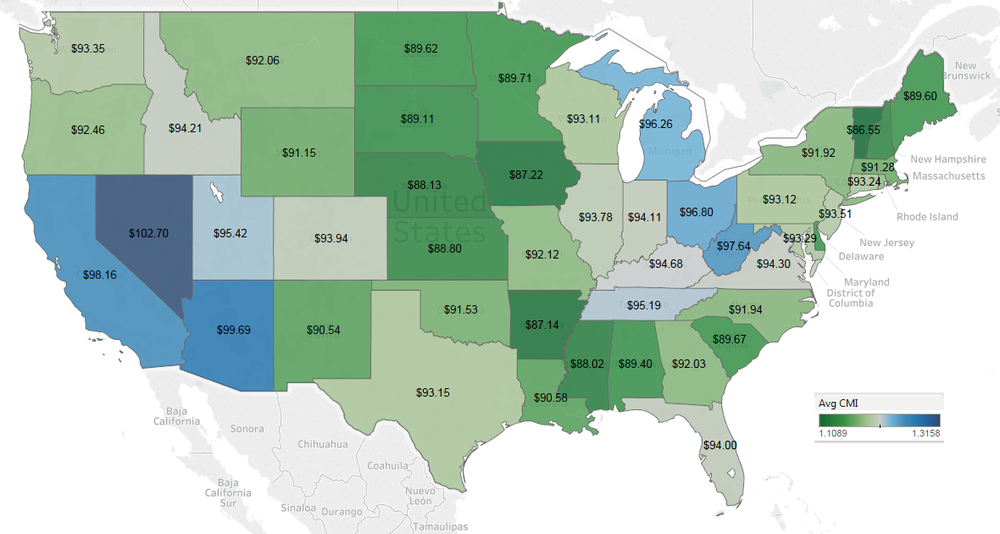
Urban – click to enlarge
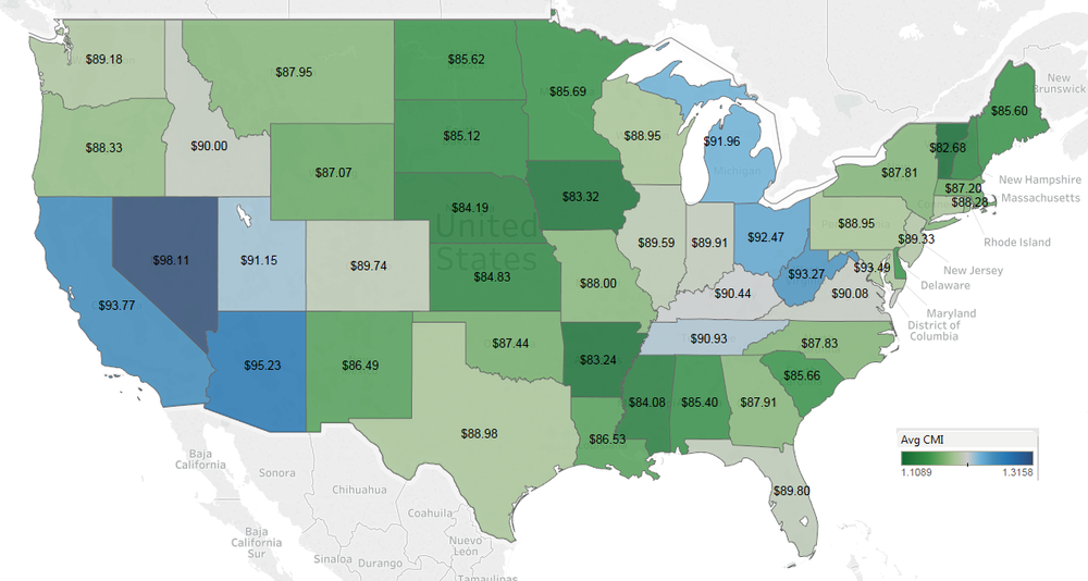
Rural – click to enlarge
Note that for the first 3 days of the stay you get 3 times the rate shown on the map. On day 4 it goes back to the rate shown.
These maps look significantly different from a lot of the others we’ve seen. The southwest of the US, Michigan, Ohio and West Virginia would have the highest NTA rates. Remember this is using 2017 data so it assumes that providers make no adjustments which is not realistic. This simply shows you a starting point. If your facility has a low NTA rate, it may just mean you have work to do, documentation-wise.
Speaking of individual facilities, let’s take a look at that as well. The map below shows every SNF in the US that accepted Medicare Part A patients in 2017. The visualization is interactive. You can view either rural, urban or both. You can filter by NTA rate. (Note that this map is showing ONLY the NTA rate. There are a total of five rates that make up your pay under PDPM.) You can also zoom in to see detail. Hover over a facility to see the name, NTA Rate, NTA case-mix index and whether the facility is urban or rural. (This isn’t going to work well on mobile devices, FYI.)
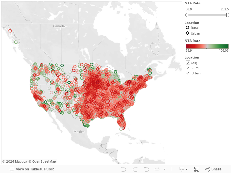
Use the rate filter to show only the highest or lowest NTA rates. Notice there is a big pocket of low NTA rates that covers most of Iowa. Also notice there are very few facilities with low NTA rates in the Appalachians.
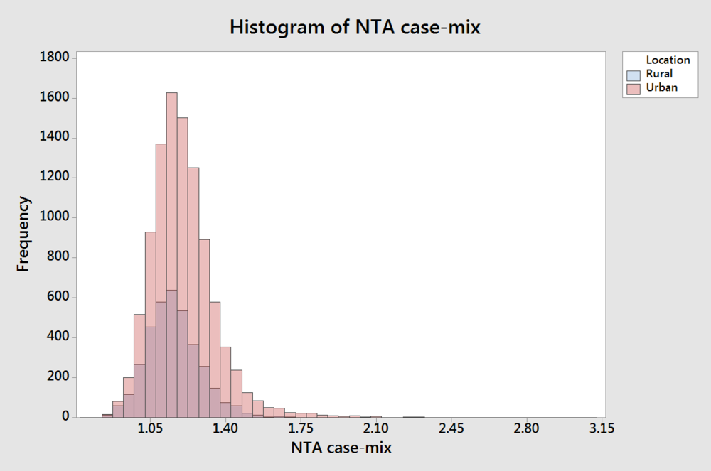
Lastly, let’s look a little more closely at rural versus urban. You can see in the histogram that not only are there a lot fewer rural facilities, but they also appear to have lower average case-mix. AVONA confirms that rural facilities do indeed have lower NTA case-mix. (Click either image to enlarge.)
It is not clear why this would be the case. If you have an idea let’s discuss!
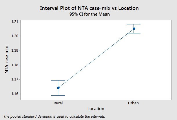
ANOVA – Rural versus Urban NTA case-mix (click to enlarge)